The idea for this collection is exceedingly straightforward: Collect accurate urban plans and re-draw them at the same scale using the same graphic convention so that students might establish a frame of reference for their design work. This is not an altogether unique or astounding idea, however, throughout the past sixteen years in academia and practice, it is one that colleagues, architects, urban designers and students found of interest.
As a design instructor, I find that students often have difficulty conceptualizing the scale or size of their project’s program, sites or precedents. Frequently they go about their design comparatively unaware of the project’s actual scope. To help, I suggest that they draw something with which they are familiar at the same scale as their design project or site. Though varying depending upon the student or project type, I usually suggest their house, apartment or apartment building, the School of Architecture and Planning building or urban spaces. Occasionally, the object relates to their past experience. For a retired US Navy commander who embarked on a graduate architecture education, I suggested he draw his old destroyer.
The outcome of this exercise is manifold. First, there is an immediate awareness of their project, site and the object’s true size and that, more often than not, surprises students with a realization that what they knew, or thought they knew, was much smaller or much larger than imagined. Through measuring and drawing the familiar, students can link the past or present to their design project and the future. The drawn frame of reference transforms both the unknown and the apparently known into the reality that they inhabit.
This, in turn, creates a framework or frame of reference for their own work that allows them to see their work as part of a continuum in the design environment, in other words, it places their work in the historical and physical context.
The frame of reference is a type of metaphor or analogy that helps link what is known to the unknown thus allowing for comprehension of new situations, conceptualizing unfamiliar forms and, moreover, solve problems based on semantic relationships. Often, it is metaphor that helps activate or prompts sudden insight. Commonly known as a “Eureka! moment”, epiphany or “ah-ha” moment, this insight is the sudden and emotional recognition that there are relationships previously isolated and unrelated semantic elements. That these suddenly recognized connections occur in the context of visual media, problem solving—and even the realm of “getting” jokes--is no accident. Recent studies have shown that insight, understanding metaphor and semantic processing occur in the same temporal area of the right hemisphere of our brains. It is also the same part as the understanding of jokes. (Jung-Beeman, Bowden, Haberman, Frymiare, Arambel-Liu, et al, 2004) It is critical, therefore, that in the learning process, students be exposed to the unfamiliar in relationship to the familiar so that they might make unconscious and then conscious leap to reconceptualize their own work. Hopefully, this can lead to the unfamiliar or the design of things yet to be realized. As Jung-Beeman, et al conclude, “the nature of many insights [is] the recognition of new connections across existing knowledge.” (Jung-Beeman, Bowden, Haberman, Frymiare, Arambel-Liu, et al, 2004)
Moreover, the urban precedent helps establish a conversation between the past and the future. Unlike a monologue, this temporal dialogue is one in which the past and future inform one another. It makes precedent tangible. Though precedent can sometimes hinder reconcepualization, an informed architect can move through a series of design ideas and relate them to a greater historical and theoretical context. Access to varied plans allows the student to consider and examine a range of spatial patterns. Examining patterns, such as street hierarchies, ground plan dimensions or path/room relationships, helps develop the differences between formal ordering and actual movement in the space.
A Need for Compilation
While accurate architectural plans are readily available, the same cannot be said for urban plans. Published in journals, books or amassed in typological collections, architectural plans are often easy to find. Examples of this include Roger Sherwood’s Modern Building Prototypes (Harvard, 1978), Werner Blaser’s Drawings of Great Buildings (Birkhauser, 1983) or Richard Weston’s Key Buildings of the Twentieth Century (Norton, 2004). In contrast, urban plans are generally not highlighted in architectural or urban planning journals. Moreover, there are no corollary urban plan compilations. Compounding this deficiency are inaccuracy, inconsistency and variability of plans published in many books and journals.
Inaccuracy is oddly enough, quite common as plans often vary in dimension and geometry. This was underscored a few years ago, when a student showed me her research of Piazza San Pietro in Vaticano. Though garnered from three reputable urban design books, each plan differed in dimension, geometry and in cardinal direction. At first, I thought her unmatched collection was an anomaly, however, it turned out to be more common than I imagined.
If accurate plans are, indeed, found, many architects and urban designers usually draw them using varied conventions over many years, to serve various needs. The drawing conventions only seem consistent in their differences. While it is easy to accommodate varied line weights and poché, the most common variation is in cardinal direction. While “north up” is a common convention today, it was less so in the past. If that convention was followed, it was rarely consistent. Some specific cities are oriented in one cardinal direction, despite that other contemporaneous city plans are drawn--often by the same architect—with North up. This is especially true for Bordeaux that is commonly delineated so that the riverfront urban spaces open to the bottom of the page. Even in design practice, sheet composition or design concept often overrule cardinal direction.
Like architectural plans, urban plans are drawn at a variety of scales. Owing to their size, urban plan scales vary extensively and are more easily affected by drawing conventions. The range and types of scales encountered while compiling this book have included 1:1250, 1cm=200m, 3/8”=500’ not to mention U.S., French, Russian, Polish and other pre-modern or regional measuring systems. Though a graphic scale is common, they are often published with a written scale, the most common of which is the ratio or representative fraction. While that ratio may be the actual scale, if the drawing was reduced or enlarged even slightly, the stated scale is irrelevant. Even the drawing tools themselves start to affect the representation at smaller scale maps. Maps smaller than 1:5000 (as the ratio increases, the scale becomes “smaller”) quickly become inaccurate as an ill-advised line thickness or flick of a pen nib can mean a serious set back to a city’s dimension.
Accurate urban plans are often limited to specific regions. Western European urban plans are readily available while Asian urban plans are quite rare. While this might be attributable to a specific architectural or urban canon or western bias, it is more likely based on differences in conceptual and on representational traditions of the urban fabric. Regardless of western or non-western differences, it is moderately difficult to find a wide range of cities even within the Western Hemisphere. As a result, comparison of one French city to another French city is challenging but the comparison between cities in different regions or hemispheres is nearly impracticable.
Two collections that ameliorate the dearth of city plans are Wayne Copper’s Cornell University Urban Design Thesis and Robert Azure’s Encyclopédie de l'Urbanisme. Copper’s 1967 thesis was originally a folio of thirty-seven figure-ground and figure-ground reversed plans drawn at various scales on 8 /12” x 11” unbound sheets. This collection was further edited, redrawn and inserted in the 1982 Cornell Journal of Architecture 2. Although the Journal plans are of high quality, there are only thirteen predominantly pre-modern, western cities and, like the thesis, drawn at different scales. Moreover, many of Copper’s plans were based on Baedeker guidebooks due to the “deficiency of city planning documentation in major libraries”. (Rowe, As I was saying, III, 17). A second, more comprehensive collection is Robert Azure’s Encyclopédie de l'Urbanisme. This three-volume, unbound folio provides a broad spectrum of urban spaces throughout the world including miscellaneous post-World War II suburban housing and shopping centers in the United States and Europe. Each folio sheet contains a plan, several photographs and a brief description. Though drawn with relatively consistency, they are at varied scales and are often with little context beyond the spaces themselves.
Of course, this criticism may be leveled against any collection—and this collection is no exception. While I have made every effort to find accurate plans and delineate them consistently, to maintain this rigor is extremely difficult and it is expected that more than one plan may be contested.
Methodology
The process for this compilation was fairly straightforward: Collect plans from authoritative, primary sources and redraw them at the same scale using identical graphic conventions. By “authoritative” I mean those plans published or commissioned by governmental agencies that, in turn, are used and distributed for official, legal purposes including planning, building or historical documentation. While “authority” does not guarantee accuracy, it increases the likelihood. In contrast, maps published by a tourist agency, even those of a government agency, are usually composed, simplified and otherwise edited for the tourist trade.
The majority of the plans came from the Library of Congress’ Geography and Map Division in Washington, DC. This vast collection includes original folios and atlases from foreign and domestic sources. Adding a bit of intrigue to this collection are the once top secret, now declassified, maps drawn by the Central Intelligence Agency or captured by the War Department during and after World War II. The second most common sources were hard copies from individual city planning offices or equivalent digital versions now available on many city websites. Satellite imagery websites, such as TerraServerÓ and GoogleEarthÓ, helped verify and update older urban plans.
Since cities are constantly changing, the plans in this collection are usually an amalgamation of several plans. For example, parts of London have changed dramatically since World War II but combining pre-World War II Ordnance Survey Maps, web based maps and published building plans, I was able to make a somewhat up to date plan. All plans were scanned into PhotoshopÓ, re-sized, edited, overlaid and then traced into figure/ground. These amalgamations then transferred into vector AutoCADÓ drawings.
Drawing Type
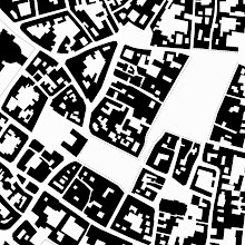
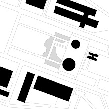
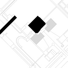
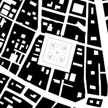
The figure/ground plans in this collection are what might be called “modified Nolli” plans. Similar to Giambattista Nolli’s 1748 plan of Rome that delineated important, semi-public interior spaces along with exterior public spaces, in this collection, plans delineate areas that are generally open to the public or are considered part of the urban experience. For example, the Campidoglio’s colonnade is part of the urban space and included, however, the interior of the Palazzo dei Conservatori and Palazzo Nuovo that are considered “public”, but are secured at night, are not delineated. In all spaces, there was a practicable effort to represent colonnades or arcades. There are, more than likely, circumstances where several important loggias, slots, alleys or other areas that may be crucial to the spatial experience were excluded for practical reasons or simple inadvertently excluded.
The horizontal cut in these plans is approximately one meter above the ground, however, this does vary to some degree. Again, at the Campodolgia, Michelangelo’s piazza is several meters above the Piazza d' Aracoeli at the base of the Cordonata stepped ramp yet is delineated as if it was at the same level. Of course, this exposes one of the problems with the figure/ground in which everything is delineated as if it were flat. As Wayne Copper notes in his own collection, “It would be absurd, for example, to attempt to analyze midtown Manhattan with only one level of plan…although in Rome it would not.” (Copper, 44) So much for sensibility of this collection that includes four plans from Manhattan.
Included and Excluded Plans
The most frequent questions by colleagues, friends and critics concerned what plans should be or should not be included in the collection. Why, for example, are their fourteen squares from Italy but only one from Turkey? Why are there fifty-seven European spaces and only nine African and Asia spaces combined?
Familiarity played a role in plan selection. Students and faculty need to identify with a space or know it through experience in order to establish the frame of reference. I tried to include spaces that a range of people may have visited or were aware of in their education. It wouldn’t help, in many cases, to focus on obscure albeit interesting spaces, as a wide audience would not know them. There was a bias to include important, frequently visited and populated cities. While a plan of Tallahassee, a planned city similar to Philadelphia and of interest for its urban form and transformation was not included in favor of plans more familiar to a larger population.
The spaces are primarily secular, public, open-air, identifiable figural void spaces. That is, the spaces are identifiable rooms in a city defined by a clear contextual perimeter. The context is dense and the void or room of the square or space is correspondingly solid. Ambiguous spaces could have been included, but I opted, especially in this first attempt at an urban plan compilation, for those spaces that were recognizable rooms in the city. Perhaps other authors will follow with a more complete collection of ambiguous urban spaces.
Though the focus was primarily on secular spaces, it was not always easy to disengage civic from sacral space. Activities in spaces change throughout the day or, for some cultures, civil and secular activities are more fully integrated. In many Islamic countries, for instance, the mosque complex is a gathering space for civic rallies, socializing and even a market. Identifiable rooms in the city are more common for cultures that have a greater tradition of social, open space. Societies with less of a tradition of urban squares, such as the Japanese, are, of course, less likely to have public squares and, for that matter, are less likely to design and draw them. Sometimes the public gathering space is not a figural void but a street, park or an identifiable non-physical place based on temporal rather than spatial perimeters.
More often than not, determining the collection’s contents came down to what was available. The smallest scale plan used for the collection were plans, less than fifty years old, drawn at 1:5000, though I preferred 1:4000 and larger, and that delineated building outlines. If a space met several criteria listed above but were only available from a secondary or tertiary source, they could not be included in the collection. A common problem seems to have been governmental bureaucracy and the political relationship of the United States government with nations behind the Iron Curtain. For example, while I hoped to include Havana, Budapest and Sofia, there was little access to large-scale plans available to me in those countries and none at the Library of Congress.
Accompanying all plans is a brief commentary most of which are illustrated with diagrams. The fundamental intention of these descriptions is to raise, albeit briefly, design related issues and opinions for a student’s consideration. Rather than purely historical, which I defer to more qualified authorities, these descriptions hope to describe why a space might be important to study. Historical highlights are incorporated simply to place the space in the historical context that affected the space’s design and morphology.
Ultimately, it was difficult to select sites. The nature of squares, their importance to the society that built and used them, their tradition or lack thereof in any given culture makes any uniform criteria leading to a definitive collection nearly impossible. That there could be no one set of criteria reveals that the concept of public space varies greatly from country to country and from region to region and that is a strength in understanding urban form throughout the world. Though there was no uniform criteria, several issues helped select the sites and make any collection possible. As it was frequent, it was as difficult to answer. Answers delved into representational tradition, historical canon, familiarity and even political bias.
Representational Bias
Before deciding to use or review this collection, it is important to recall that there are several inherent problems with the figure/ground drawing. While Wayne Copper, Peter Bosselmann and others more fully elucidate this topic, it should be briefly noted that, like any representation, the figure/ground represents reality in an abstract, often over simplified fashion. The black and white figure-ground is especially reductive as it only differentiates inside and out, solid and void with little literal regard for section material or time. While these are accepted limitations, they are limitations nonetheless. Like a plan, section, digital model, scale model or other representational method, they are narrow, reductive glimpses of reality. Subtleties can be found in the plan but it requires additional information such as photographs or sections and the experience to know that the thickness of building can be understood as a particular building type. This, of course, raises the extent or capacity of the figure/ground to delineate space or space in the twentieth and twenty-first centuries. As building technologies transform building envelopes and as the urban realm becomes less “black and white”, the figure-ground drawing begins to lose meaning. The most regrettable aspect of the figure/grounds is that they sometimes remove the interiors, materiality and other textures of a plan. The strength of the figure/ground as a diagram, however, outweighs its inherent limitations but only long as the student or architect is aware of the limitations. It can be an excellent tool as it quickly and clearly delineates the spatial patterns of the voids and solids in the urban fabric.
Lastly, all representations reveal bias. There is no such thing as an objective, accurate and unbiased drawing. A plan, section, perspective, scale model, digital fly-through or any representation of reality involves decisions of representation that help communicate ideas or, in some cases, to augment reality. From a Fourteenth century city-state’s map that overemphasized its domain to Saul Steinberg’s “New Yorker’s View of the World”, graphic representation shows the authors depiction of their reality.
While I attempted to be accurate, there were times when the plan should be cut to retain the convention for accuracy or convention for clarity. I chose clarity as it best communicated the book’s intentions. For example, if Le Corbusier’s Voison Plan was cut one meter above grade, the drawing shows the building’s piloti. While that would have been accurate, I felt, that the more informative cut would be one story higher. It is true that Le Corbusier intended that the ground floor appear and surface of the earth move beneath the buildings and the mass float above the ground plane, but as an architect, I felt that the mass would be more revealing.
With this admitted bias, I strove for accuracy, yet I am sure there are errors and omissions. I welcome any suggested corrections or additions and, for that matter, welcome any large scale, accurate, authoritative city plans for this evolving collection.
skip to main |
skip to sidebar

Eric J. Jenkins
One Hundred Urban Plans
To Order On Line
Routledge 2008
Now available in the United States and Europe
Arras
Barcelona Eixample
Bath
Brasilia
Chandigar
Paris Place des Vosges
Eric J. Jenkins
To Scale, Too!
See Joshua Simoneau’s 3-D modeling of To Scale
http://www.youtube.com/watch?v=OYASjeePZto&feature=related
Links
Here are a few links that may be helpful for those interested in urban design:
Project for Public Spaces
Good, if populist, resource on public spaces. The authors take a more "I know art when I see it" approach but otherwise is a fairly common sense attitude toward public spaces throughout the world. http://www.pps.org/
Urban Design
UrbanDesign.org is based in Alexandria, Virginia. The site has a wide range of topics including information on transportation, conferences, books and examples of good, if at times nostalgic, urban design projects (Other than Europe and Canada, is there a U.S.-based "new urbanist" who has produced work that looks like it's been designed in and for the 21st century? The idea that new towns should be clothed in pre-industrial garb but wired for the 21st century is somewhat disturbing. ) http://www.urbandesign.org/
Stadtkreation
This site, created by a German urban designer, is a good sources of urban design projects, texts and links. http://www.stadtkreation.de
RUDI-Resource for Urban Design Information
Resource for Urban Design Information (RUDI) is a UK based web resource dedicated to urban design and place making. http://www2.rudi.net
Catholic University’s Master of Architecture Urban Design Concentration
http://architecture.cua.edu/academicprograms/urbandesign.cfm
Models of Ancient Rome
http://www.maquettes-historiques.net/P5.html
Nolli Plan
http://www.lib.berkeley.edu/EART/maps/nolli.html